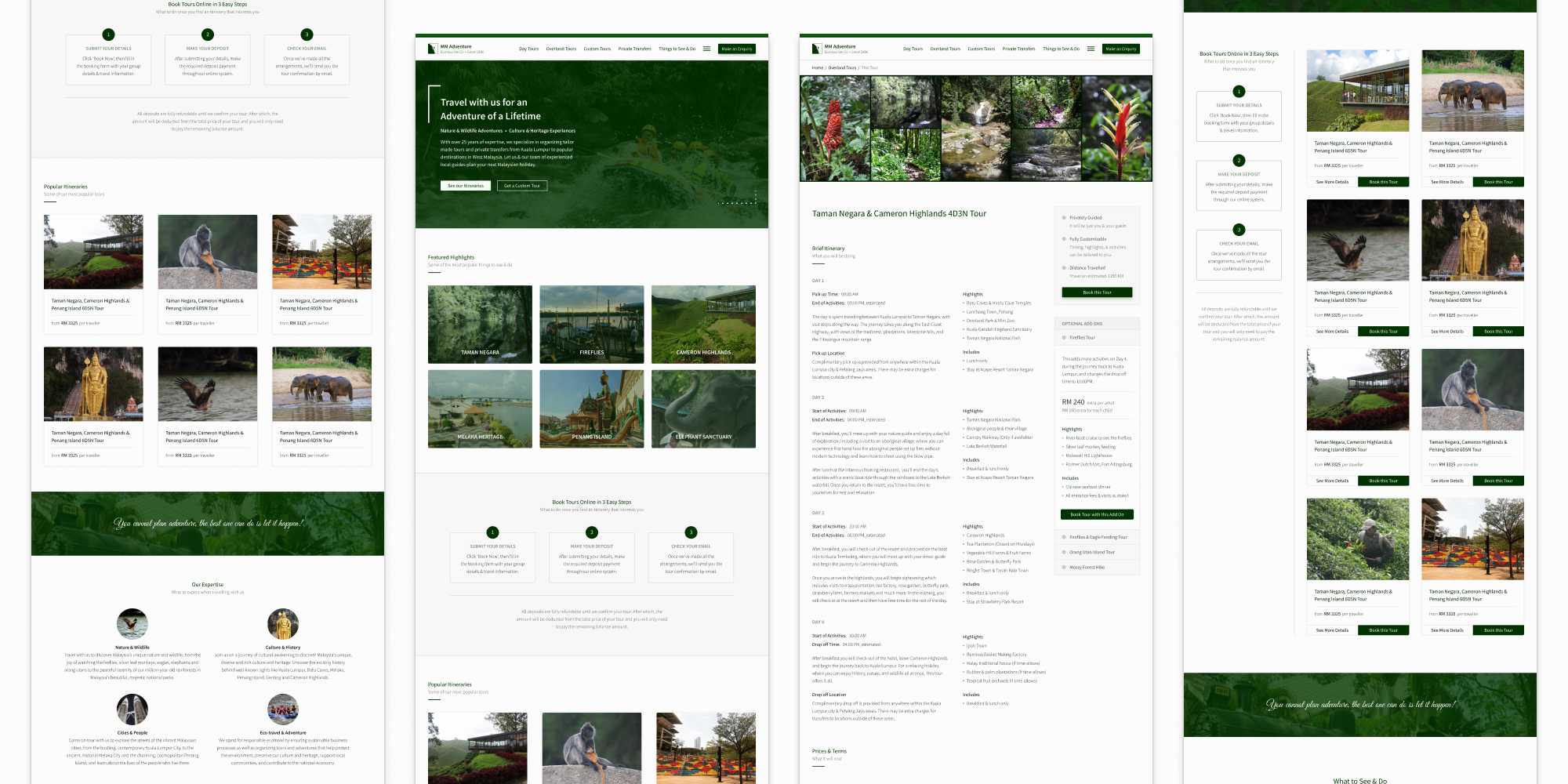

A few screens from the final design.
Improving the Experience Travellers Have when Browsing for Information while Planning Holidays Online
UX Design, Information Architecture, Structured Content Design, Mental Model Research
After over 25 years in the travel business, MM Adventure was facing a major problem with a large part of its product experience, its website. The extremely poor browsing experience users were having on the website was starting to more and more negatively affect the company’s customer experience, employee productivity, and sales.
This case describes the process I went through redesigning the experience, which ultimately improved user satisfaction, reduced the number of confused user enquiries, and most importantly, increased the number of bookings received through the website.
Year
2019
My Role
Project Lead, Solo Designer & Developer, Lead Researcher
The Team
Company leadership and all 10+ members of the sales, marketing, and tour guide teams - everyone who interacted with customers in their day-to-day jobs.
The Problem
With over two decades of disjointed website updates, products additions and changes, the company’s online experience was starting to suffer. More and more users were having trouble navigating the website when trying to browse for information while making their travel plans and when trying to decide whether or not to book a tour with the company.
Most found it too confusing, as the information they were looking for was not where they expected to find it. Many were simply leaving the site angry and dissatisfied, having not been able to finish what they came to do.
The effect it was having on the business:
Very high and increasing website bounce rate
Increasing number of confused enquiries from users, mainly asking for information that was already provided on the website
Lowering employee productivity, as employees were spending most of their time answering the same simple questions over and over again
Decreasing conversion rate. Even though the number of site visitors was higher than average, the number of bookings received was decreasing
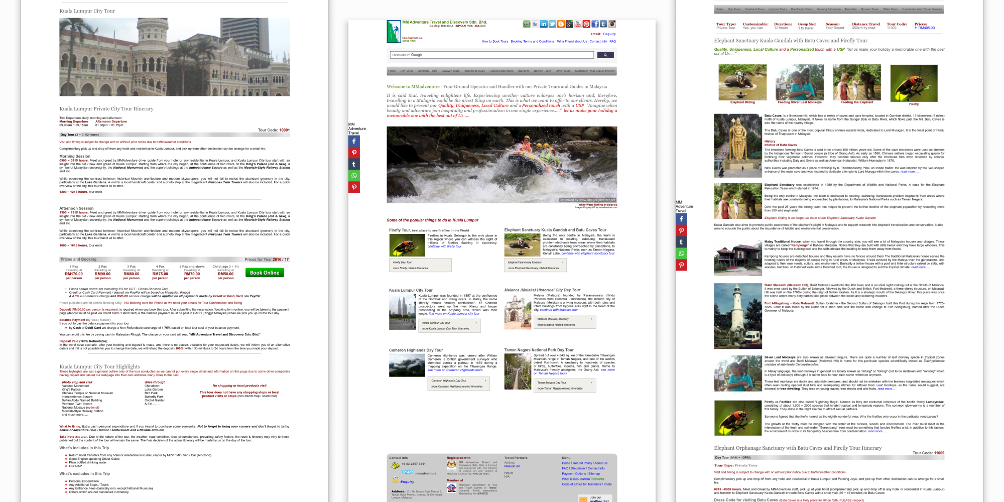
A few screens from the original design, showing sections of the home page, and different product pages.
The question was, how could we improve the experience users were having while browsing for information on the website?
The Process
Phase 1: Alignment & Discovery
I began the project by facilitating a discovery workshop with the company’s leadership team and all customer facing employees, in order to gain alignment on product & business goals, review user goals & the customer journey, identify the issues with the original design, as well as identify gaps in foundational research and any assumptions yet to be validated.
In order to better understand the problem space, I then conducted a complete UX audit, content inventory and audit, as well as gathered insights from website analytics and analyzed customer feedback collected over the previous five years.
Gaps in Our Understanding of Users
After reviewing the available data, I found that there was a large gap in our understanding of our users, specifically around the thought processes and expectations they had while browsing the website. We already knew that users were browsing for information on the website while making their travel plans, however, we had several unanswered questions, including:
What information did they need and expect to see while making their travel plans?
What thought process did they go through while making travel plans?
What did they expect to be able to do online while making travel plans? (Either on a travel website or on the internet generally)
What decisions did they make while planning travel and what were the intents and motivations behind each of those decisions?
Phase 2: User Research
To fill these gaps, I decided to conduct exploratory research to better understand people who are planning their holidays online, with the end goal of creating a mental model diagram to visualize their thought processes.
A little about our research method
Participants were recruited from our pool of marketing leads, as well as among our group of customers who travelled on tours with us. At the time, this was the easiest way for us to get real people that represented all the different types of travellers (solos, couples, family groups) from all the different countries where our actual customers came from.
Data collection involved mainly unstructured, conversational interviews, that were conducted both online and offline, depending on the availability of the participants. Interviews were conducted by all customer facing employees, including travel consultants and tour guides, who I had previously trained in UX research methods.
Consolidating raw data into a mental model diagram
Once the interviews were complete, all recordings of the interviews were transcribed. The transcriptions then went through a careful process of review and cleaning before they were ready to be used to create the final mental model diagram.
In creating the diagram,
I first summarized the transcripts into simple participant quotes that captured key points from each of the interviews.
Similar quotes were then grouped together into boxes to represent key insights shared by multiple people.
These key insights (boxes) were then grouped together into towers, which represented the abstract goals or motivations users had.
The towers of motivations were finally grouped together into mental spaces, which represented the specific, high-level goals users had while trying to plan holidays online.
Iterating the research process
Before moving on and creating the final mental model diagram, I went through all the data we had, to assess if there were still gaps in our understanding of people’s thought processes.
We then went through a few more sessions of interviews and iterated through the research process, until the gaps in our knowledge were satisfactorily filled. Once I was sure that the data we had was comprehensive enough, I was then able to create the final mental model diagram.
A High-level Look at the Findings
Within the mental model of making travel plans online, we found that people’s thought process generally went through a similar flow, going through the following high-level goals:
researching possibilities,
deciding on their destination, timing and budget criteria,
choosing a travel itinerary, and finally
confirming their travel plans.
For each goal, they had different needs and motivations that guided their actions, and certain expectations about their information they would need to get their jobs done.
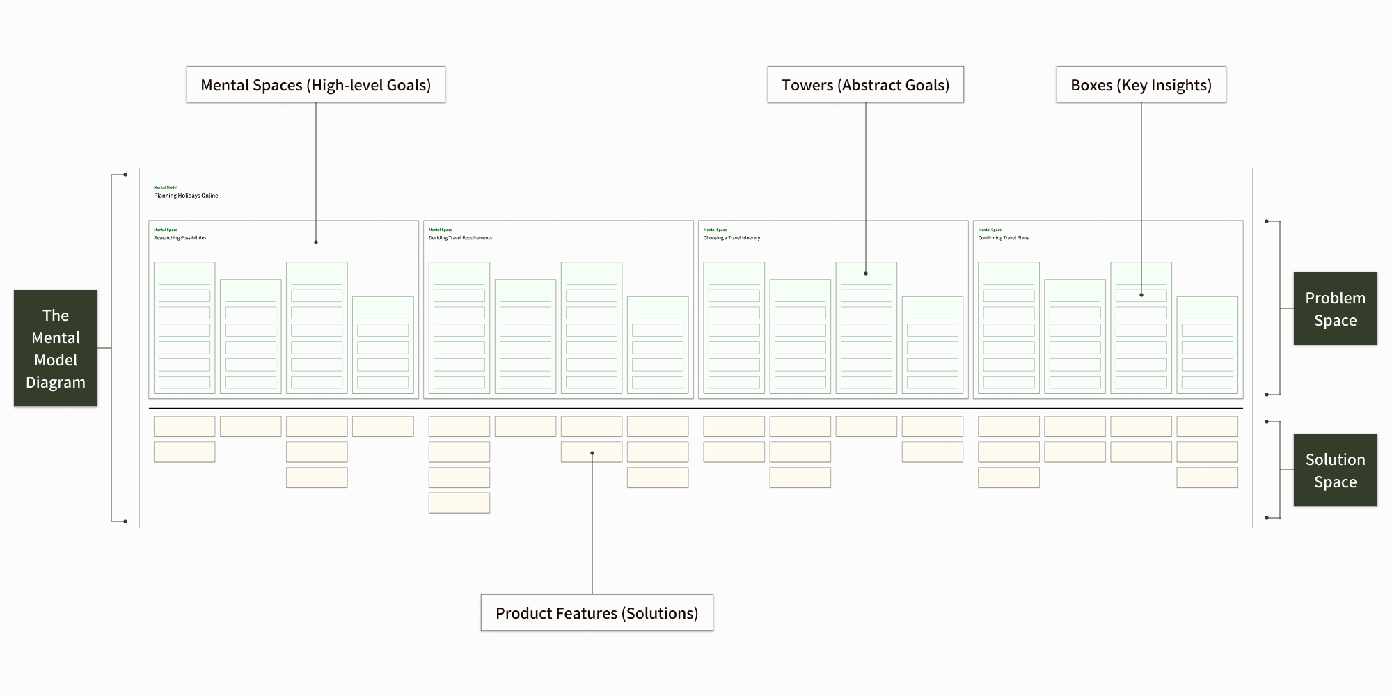
The structure of the final mental model diagram, consisting of the problem space and the solution space
Analyzing Insights in the Solution Space
Once the model was finalised, I was able to analyse how effectively content was displayed on & flowed across the website, whether or not the information users expected to find was actually present on the website, and if the information was available exactly when & when users expected to see it.
I could then identify opportunities for improvement, clearly linking between insights generated from the mental model and potential solutions that we could implement.
Three Problem Areas
I identified three problem areas that had to be addressed in order to satisfy user goals and improve the experience users had when browsing for information on the website while planning their holidays.
The lack of strategic content design and poor writing that resulted in low findability, informational dead ends and, overall, very weak information scent throughout the website.
The navigation structure of the website that provided too many options at once and, overall, didn’t match the mental model users had when making travel plans.
The visual design of the website that was plagued by inconsistencies in vertical alignment, poor visual hierarchy, overuse of colours, as well as inconsistencies in font use and text styling.
Phase 3: Content First Design
The goal of this phase was to finalize the content types that would be published on the website, determine the best content structure to satisfy both business and user needs, as well as to finalize the page layouts for each content type, ensuring high findability and information scent, before jumping into the visual redesign process.
The structured content design workflow I followed involved:
Reviewing insights collected from experience mapping, content analyses and from the mental model research, in order to create a domain model that identified all the core concepts and the relationships linking them.
Defining the new content structure by specifying the final content types that would make up the new website structure (eg: product pages, landing pages, terms pages), listing all the pages for each of the content types and listing all the content topics for each of the pages.
Refining the new content structure by creating block templates for each content type and then create more detailed priority guides for each of the pages.
Creating the new site navigation structure by mapping the links between each of the webpages, based on the domain model created earlier, and then mapping the interaction flows throughout the website, based on the mental model research.
User testing to validate the relevance of each content type and the corresponding content topics, to validate if the prioritization of content topics within the page layouts matched user expectations & needs, and, finally, to validate if the site navigation structure matched users’ mental models. This step was iterated until were able to create the most effective priority guides and site navigation structure.
UX writing to finalise all the copy for each content topic. Final page layouts were then created with the final fully written content to ensure that everything would fit into the new layouts nicely.
Phase 4: Visual Redesign
With all the content, layouts, and interaction flows between webpages finalised, it was a very smooth process to design the final look and feel and visual layouts of all the webpages.
This phase was done in conjunction with creating all the elements and components for the new design system we were creating, and so it was also a smooth process to ensure that everything was consistent and unified.
Phase 5: Roll Out
Once the final designs were confirmed, as the company’s solo developer, I then proceeded to code, build and then launch the redesigned website.
Going forward, we conducted regular A/B tests and customer interviews to ensure that the current design was still meeting user needs and expectations. Over the years since launch, since the initial design process was comprehensive enough to ensure that we addressed all the major problem areas, any future changes that had to be made were generally minor, quick fixes that improved upon the main solutions that were initially implemented.
Key Decisions
1
Redesigning the website's information architecture
The main navigation menu in the original design simply listed all the available tour itineraries and their many variations, resulting in dropdowns up to 4-levels deep at times. This made it very difficult for users to find information they wanted, and mostly overwhelmed users with the many options presented to them.
Yes, most links to information that users would expect to see was included either in the header or the footer of the original design. However, mainly due to inconsistencies in colour, font styles, and alignment, but also because of the poor content organization structure and layout, it was quite difficult for users to skim and find the information they wanted.
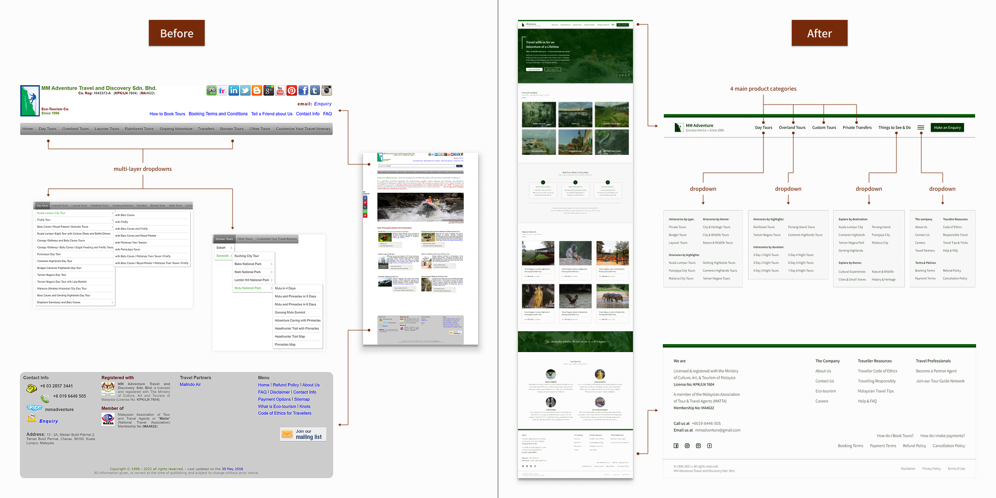
Before & after versions of the header and footer of the website
In the new design, the main navigation menu was simplified into the 4 main product categories with simple dropdowns organizing tour itineraries by highlights and themes, a dropdown section for things to see & do and, finally, a dropdown section for other important information users expected to see like information about the company, important booking terms, and general travel articles.
As we found through user testing and user interviews after launch, the simplified design of the new header and footer sections of the website matched users’ expectations for content categorization and so made it much easier to find information they wanted to see, as well as to discover information they considered important but didn’t expect to find.
2
Clearly Explaining the Booking Process
Before the redesign, a large portion of the enquiries we were receiving from users were questions asking for clarification of how the booking process worked. And so, one of priorities was to create a visual representation clearly describing the booking process and adding it to parts of the website where users found themselves thinking about booking tours.
Based on our testing, we found that the most effective places to include it was high up on the website’s home page, on the product category pages, as well as low down on the product pages.
Once the new website was launched, there was an immediate decrease in the number of enquiries we received from users trying to get clarification about the booking and payment process. Instead, there was a steady increase in the number of bookings and payments received, clearly showing that users could easily understand what they needed to do and were able to do it successfully.
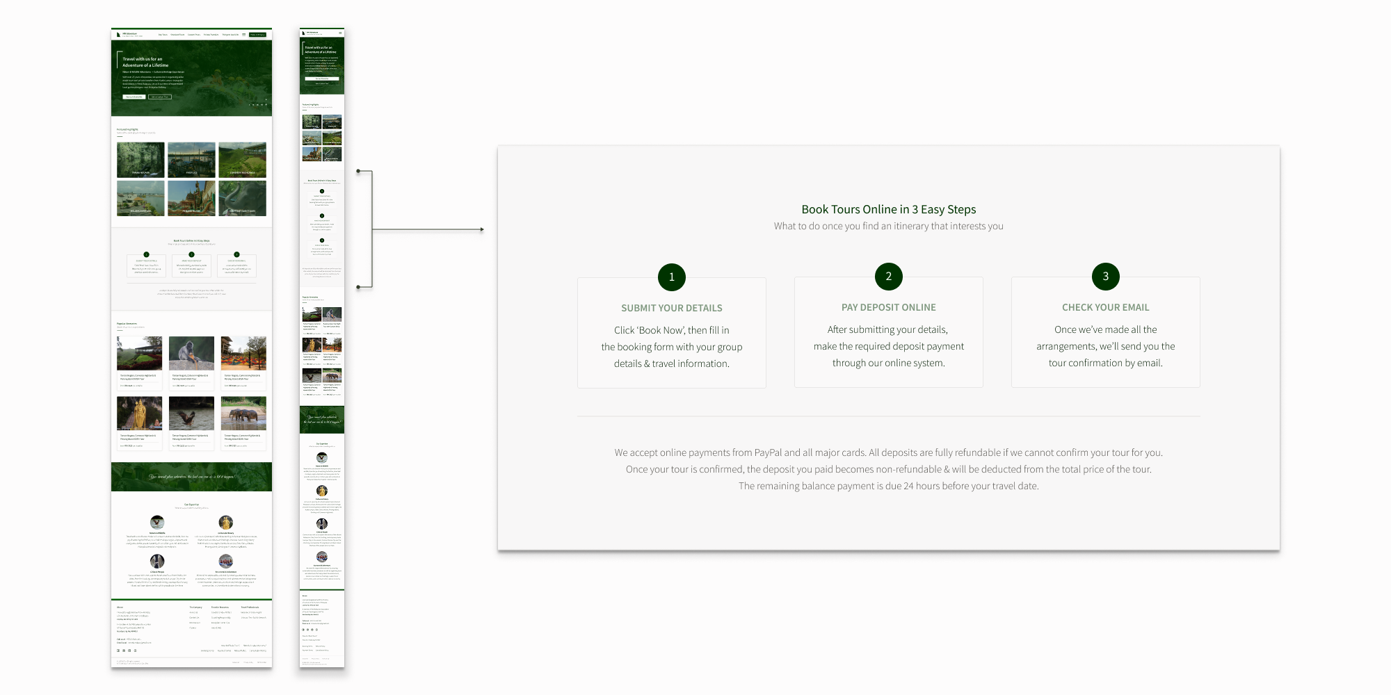
The simple description of the booking process, as it appears on both the mobile and desktop views of the website’s homepage.
Once the new website was launched, there was an immediate decrease in the number of enquiries we received from users trying to get clarification about the booking and payment process. Instead, there was a steady increase in the number of bookings and payments received, clearly showing that users could easily understand what they needed to do and were able to do it successfully.
Key Outcomes
As more than half of the customer journey takes place online, with people using the website to search for travel information, plan travel itineraries, communicate with the company, as well as book and pay for tours, we started noticing the positive impact from the redesign almost immediately after it launched.
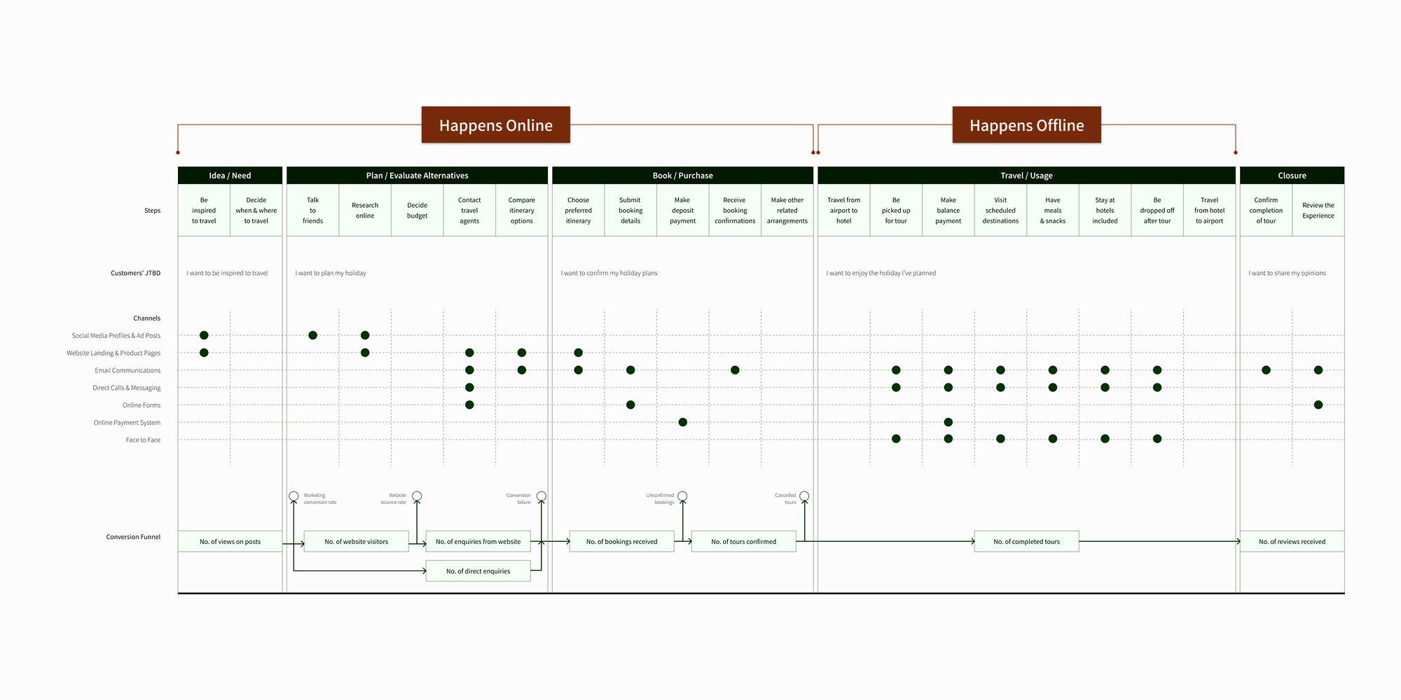
A simplified version of MM Adventure’s omnichannel customer journey map.
Better browsing experience, higher user confidence, less steps taken to booking
By taking advantage of good information scent, we created a much smoother browsing experience, where content and page links were presented in a way that met user expectations, piqued their interest to continue browsing, and helped them flow through the purchase decision process seamlessly.
As users were able to find the information they wanted or needed, when and where they expected to see it, there was a general increase in user satisfaction, trust and confidence in the company. This resulted in higher number of bookings received and noticeably less effort expended in persuading or convincing users to book our services.
Better browsing experience, less user confusion, more productive employees
As users could more easily find the information they wanted and were less confused while browsing for information, they were less likely to need to ask for further clarification before deciding to book tours.
This meant that travel consultants spent much less time responding to simple customer enquiries explaining and clarifying the same things over and over again. Instead, they were able to spend more time crafting custom itineraries and converting higher value customers.