Unifying Online & Offline Touchpoints to Create a Seamless Omnichannel Experience
Design System Creation & Management, Brand Design, Change Management
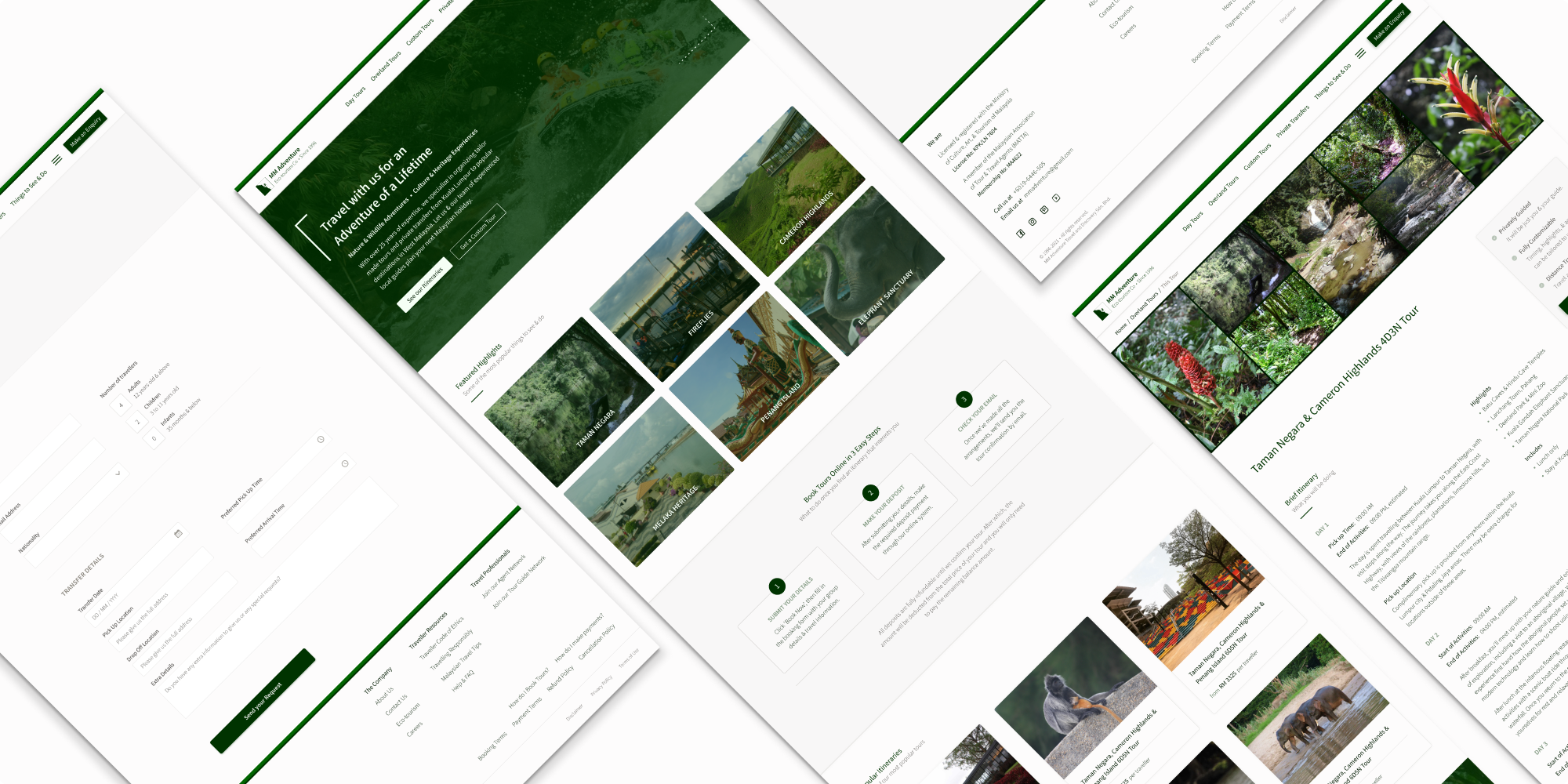
Since its incorporation in 1996, MM Adventure has been operating, both, online, with its website where users plan travel itineraries and book their choosen tours, as well as offline, where the company organizes and conducts tailormade tours for its customers. Therefore creating a consistent, unified experience across all brand touchpoints, has always been a top priority of company leadership.
However, after over 25 years of implementing various strategies to address this challenge, one thing the company has never actually had was any clear and comprehensive documentation or guidelines for design and development efforts.
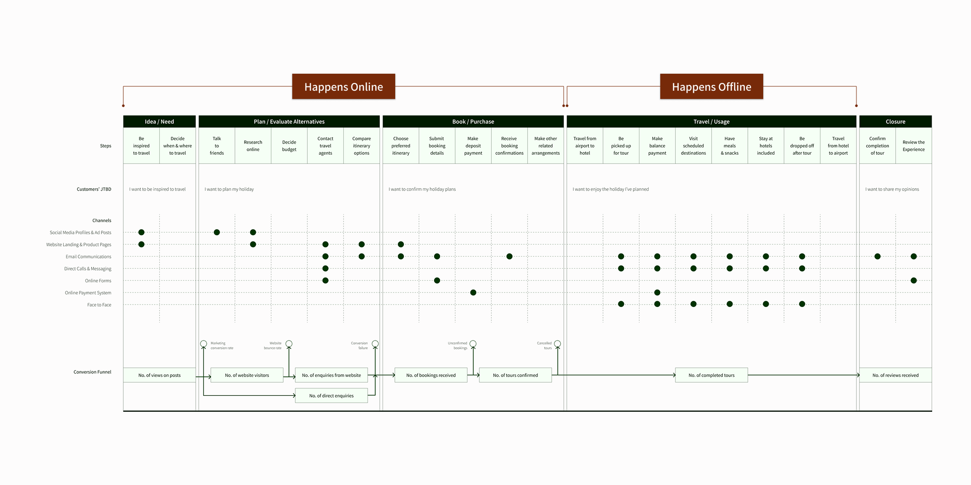

A simplified version of MM Adventure’s omnichannel customer journey map.
And so, I decided it was time to create a design system that would serve as a company-wide source of truth for all design and development efforts going forward. It would need to be comprehensive enough to satisfy the needs of all departments within the company - product, engineering, sales, marketing, and administration - and would need to encompass designs created for all online and offline touchpoints within the customer journey.
This case goes though the process we went through in creating the omnichannel design system, how we still manage it, and why it has been successful, becoming an invaluable tool that has been used in 100% of projects since its launch.
Year
2019
My Role
Project Lead, Solo Designer & Developer, Lead Researcher
The Team
Company leadership and all 10+ members from the sales, marketing and administration teams - everyone that would be using the final design system.
The Problem
The lack of a source of truth to guide design and development decision making was significantly affecting the team’s ability to create designs and write code effectively and efficiently. Productivity across all teams was being severely impacted.
The problem was two-fold:
1
The random use of design elements
Part of the problem was that design elements, including colour, typography, icons, and layouts were being used randomly and differently throughout the company, across the company’s website, in social media posts, email communications, marketing materials, as well as on documents like letters, invoices and receipts.
All these inconsistencies resulted in a confusing and disjointed customer experience. At times, communication materials seem to have come from different companies!
2
Extensive task redundancy
Another issue was that when creating new web pages, product features, and communication or marketing materials, a large portion of time was spent on ‘setting-up’ - basically, the designing and coding of basic foundational elements such as navigation systems, page layouts, colours, typography, and icons.
Each project began with the creation of new versions of these elements. This was not only an inefficient use of everyone's time but also led to numerous design errors and inconsistencies.
And so, we launched the project with the following questions in mind:
How might we ...
create a design system that would be useful to the entire organization, not just the product and engineering team.
create a design system that is comprehensive enough to be used when creating a seamless experience across all online and offline customer touchpoints.
create a design system that is robust and flexible enough to meet all the needs of the various different teams it serves.
The Process
Phase 1: Buy in & Alignment
I first facilitated a workshop with the intention of getting buy-in and alignment from all the key stakeholders - company leadership, travel consultants, and members of the marketing, finance and admin teams. During the workshop, we analyzed pain points and potential opportunities, clarified business goals, discussed the risks and benefits of creating a design system, identified potential implementation challenges, as well as specified the project scope and requirements.
Phase 2: Discovery
I began this phase by conducting user research, mainly through one-on-one open-ended interviews, to better understand user needs and to clarify specific use cases and then conducted an audit of current designs to catalogue all existing design elements being used and to identify all the inconsistencies, redundancies, and areas where the overall user experience felt disjointed.
I then facilitated a brand discovery workshop with company leadership where we made final decisions on the brand guidelines and elements like colour and typography that would be used.
By the end of this phase, I had specified the categorization structure that would work best and defined everything that would need to be built including the foundational design elements like colours, typography and layout grids, the design components that would need to be created, as well as all the documentation required.
Phase 3: Building
In this phase, I created all the design elements and components that would be needed, compiled all the documentation required for each of those elements and components, and finalized the overall organizational structure of the design system.
Phase 4: Roll Out
Implementation began with a company-wide introductory presentation, showcasing the new design system and describing how it satisfies each of the use cases identified. I then set up processes for users to learn and get their questions asked, as well as for issue reporting and the gathering of feedback and suggestions for improvement.
Going forward, projects for the continuous maintenance of the design system was added to the internal roadmap, prioritizing issue solving and any component updates needed to keep the system useful and easy to use.
Key Decisions
1
Creating a unified design system with a company-wide shared design language
Involving all teams in the creation of the design system and making it a top priority to create a system that satisfied the needs of each team, encompassing all online and offline uses, was the best decision we made. This was the only way we were truly able to create a unified, consistent, well integrated customer experience across all brand touchpoints.
Since everyone else using the system were non-UX professionals, having simple, jargon-free documentation as well as consistent naming conventions for all components and design elements, ensured that the design system was easy to understand, easy to learn, and easy to use all around. This allowed us to much more effectively communicate and collaborate once the design system was launched.
2
Creating clear, comprehensive and accessible documentation
To ensure that the design system would be easily accessible across the company, considering everyone worked remotely, used different devices for their day-to-day jobs, and had different technological expertise, I decided to use Notion as the main knowledgebase for the design system, which would also include links to all related assets, Figma files, and documents.
I used a combination of other tools that were specific to each of the teams that would be using the system. Specifically,
design components, web layouts and media templates were created in Figma for the product and marketing teams,
document templates, media files, and master code files were created and saved in OneDrive for the use of the sales, administration, product, and marketing teams.
In order to ensure good findability of information, I used a consistent organizational structure of design elements and components across the different tools.
3
Creating a sense of ownership and community
While I was the creator of the design system and had final say over any changes or updates, it was important that all members of the team had a sense of ownership and shared accountability over the system. We were able to do this, as well as maintain a high level of team engagement over the years, with the implementation of clear processes for learning, giving feedback, and making suggestions for updates.
Key Outcomes
Within a few weeks of launching the new design system, it was being used 100% of time throughout the company. Over the past 5 years, the system has gone through regular yearly updates, ensuring it remained relevant, comprehensive and easy to use to this day.
It is a tool that has transformed the way we all work and is now being used so automatically and unconsciously by all members of the product, sales, marketing and administration teams, making it an indispensable part of our day-to-day jobs.
1
Improved Employee Experience
Having a shared design language improved the way we communicated across different teams, helped us cut down on misunderstandings when discussing design decisions, and saved us a lot of time previously spent on clarifying the different design elements and terms used by each of the teams.
Overall higher efficiency as well as having effective feedback and update processes led to more highly empowered, motivated employees and much higher job satisfaction among members of all teams. Involving everyone in the creation process and then establishing processes through which everyone could have their voices heard enabled us to create a system that consistently satisfied everyone’s needs and made it too useful to ignore.
2
Process Efficiency
Having a library of components, code snippets, and document templates greatly accelerated all our design and development processes, streamlined workflows, reduced design redundancy and increased employee productivity and efficiency across all teams.
Most notably, as soon as the design system was rolled-out, we were immediately able to reduce the time taken to create new designs and documents from several hours to mere seconds. A rate that we have maintained for the past 5 years.
3
Better Customer Experience
The higher design consistency and quality, reduced errors, and clear, cohesive brand identity, led to a noticeably more seamless customer experience. This is based both on our own heuristic evaluations, as well as on user interviews and customer feedback given voluntarily. Over the past 5 years, we have been able to successfully keep the number of design inconsistencies across our website, marketing and communication materials, and physical documents at 0.